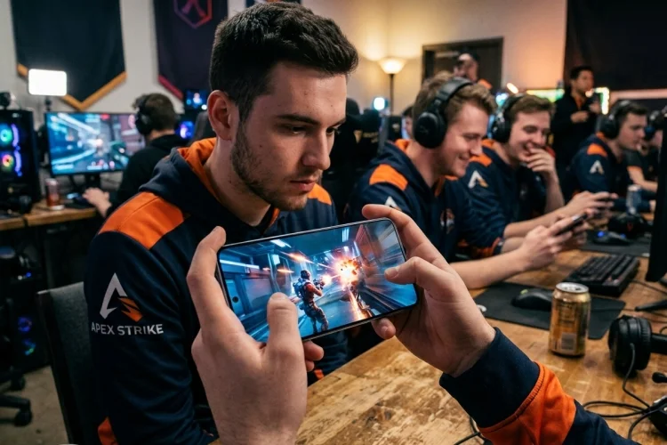
Great mobile controls often disappear from the player’s attention. People stop thinking about the interface and simply react: move, shoot, dodge, jump, repeat.
Poor controls do the opposite. They make every missed tap painfully obvious.
Understanding How Touch Target Geometry influences high-speed input helps developers create controls that remain reliable during intense gameplay.
Instead of focusing only on button artwork, teams need to consider interactive boundaries, thumb movement, spacing, gestures, device dimensions, and even input latency.
Good geometry turns a touchscreen from a limitation into a responsive game controller.
Start With the Interaction, Not the Artwork
A common development workflow starts with visual design. An artist creates attractive controls, places them on the HUD, and developers later attach touch functionality.
For fast games, reversing that logic can produce better results.
First determine what the action requires. Is it a rapid tap? A press-and-hold command? A directional drag? A continuous joystick? A button that players repeatedly alternate with another control?
Each interaction creates different geometric requirements.
A frequently tapped attack button should prioritize acquisition speed and error tolerance. A pause button can be smaller because it is rarely activated under extreme timing pressure.
This is why touchscreen game controls should be designed around frequency, urgency, and movement pattern before final visual dimensions are chosen.
Separate Visual Size From Interactive Size
A button does not have to look enormous to be easy to hit.
Apple recommends sufficiently large interactive regions, with 44×44 points serving as its general iOS and iPadOS target guidance.
Android recommends at least 48×48 dp for touch targets and explains that the interactive area can extend beyond an icon’s visible dimensions.
That distinction is extremely useful for games.
A small ability icon can sit inside a much larger invisible region. The HUD remains visually lightweight, but the player’s thumb receives additional tolerance.
However, invisible expansion should be intentional. If several buttons share the same area, developers need clearly defined ownership rules for every coordinate.
Otherwise, a solution intended to reduce missed taps can create accidental inputs instead.
Design Hitboxes Around Movement Direction
Fast players rarely approach every button from its exact center.
Someone using a virtual joystick may move their right thumb toward an attack button from below. Another player may repeatedly sweep between attack and dodge. During frantic moments, the finger can overshoot its target.
This suggests that hitboxes do not always need symmetrical expansion.
Research into finger-touch pointing has shown that touchscreen errors have characteristics that simple mouse-based pointing models do not fully capture.
Google’s FFitts work, for example, models absolute finger precision in addition to the conventional speed-accuracy relationship.
Practical game design can apply the same principle.
If telemetry shows that users consistently overshoot the right edge of a button, enlarge that edge. If almost nobody misses toward the center of the screen, spending additional geometry there provides little benefit.
This approach produces more efficient touch zones rather than simply making everything bigger.
Protect Fast Combos With Better Spacing
High-speed games often place related controls together because players need to alternate between them quickly.
The challenge is finding the balance between travel distance and accidental activation.
Place two buttons too far apart and thumb movement takes longer. Place them too close and the finger may trigger the wrong action.
Android recommends approximately 8 dp or more of spacing between touch targets for general usability. Game interfaces may require their own values, but the principle of meaningful separation remains valuable.
Developers can experiment with slight gaps between active regions even when visual graphics appear close together.
Another technique is directional bias. The side of a button facing empty screen space can have a generous hitbox, while the side facing another critical command receives a tighter treshold.
This protects rapid combinations without making the HUD feel unnecessarily spread out.
Tune Controls for Thumb Reach and Device Size
A perfect layout on one device can become uncomfortable on another.
Research into smartphone ergonomics shows that screen dimensions and physical form factors influence one-handed touch performance. Increasing device width, for example, can make some one-handed interactions more difficult.
That creates a strong case for responsive control geometry.
A game can allow players to move a virtual joystick, reposition attack buttons, change control scale, or switch between preset layouts. Advanced systems can store those preferences per device.
Handedness also matters.
Mirroring a layout is a useful starting point, but developers should measure actual interaction behavour. Left- and right-hand users may produce different touch distributions depending on grip and screen size.
Customizable positioning is often more realiable than trying to invent one universal configuration.
Treat Joysticks, Gestures, and Buttons Differently
Not every touch region should behave like a button.
A virtual joystick needs enough space for continuous motion and usually needs tolerance around its starting position. Some games even allow a floating joystick to appear wherever the player initially touches within a larger movement zone.
Swipe controls need distance. Tiny gesture zones can cause movements to end outside the recognized region before the action becomes clear.
Tap buttons need different logic because the important question is usually whether the touch qualifies as an activation.
Apple’s guidance for virtual game controls describes interpreting touch position for thumbsticks and forwarding controller state to the game, highlighting how spatial position can continuously influence a control rather than simply generating a binary tap.
Geometry should therefore reflect the type of input being captured.
Geometry Cannot Fix Input Latency Alone
Players often describe controls as “unresponsive” even when the hitbox itself is perfectly designed.
Sometimes the real issue is latency.
Android’s game optimization guidance notes that GPU-bound frame queues can increase touch-to-display latency, creating a visible delay between player input and the resulting frame.
This means control tuning should combine geometric testing with performance profiling.
A larger target can reduce missed taps, but it cannot compensate for a game that reacts several frames late. Likewise, excellent frame pacing will not save a tiny button that users consistently miss.
High-quality mobile input requires both spatial accuracy and fast processing.
Use Telemetry to Continuously Improve Touch Geometry
Touch layouts should evolve after launch.
Collect anonymized information such as successful touch coordinates, near misses, correction taps, simultaneous input conflicts, control repositioning, and device dimensions. Instead of asking whether a button “feels okay,” teams can examine measurable patterns.
For example, imagine that 70% of misses around a dodge button appear below its visual boundary. That pattern suggests directional expansion rather than a complete redesign.
A/B tests can compare alternative hitboxes while keeping the artwork identical.
Over time, developers can build device-specific or user-adjustable presets based on real behavior. Touch geometry then becomes part of live game optimization instead of a one-time UI decision.
Fast mobile inputs depend on more than attractive buttons. Effective geometry combines generous touch regions, smart spacing, comfortable reach, gesture-specific behavior, and low-latency processing.
Treat every touch zone as something that can be measured and refined. Study real player inputs, test multiple devices, and keep improving the layout until interacting with the game feels nearly automatic.